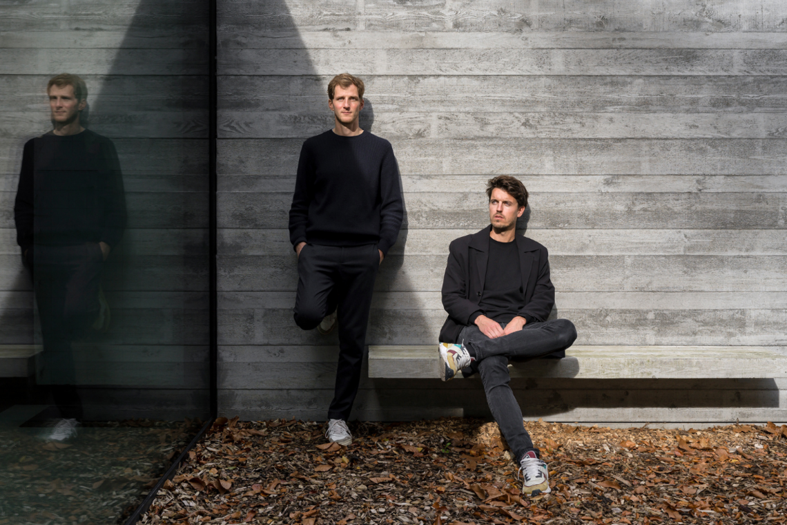
With his project Typo Belgiëque, type designer Jo De Baerdemaeker, who has already developed fonts for Google and Microsoft, dusts off a piece of Belgian typography history. At the same time, he breathes new life into some typically Belgian typefaces, which until recently were a well-kept secret.
Jo De Baerdemaeker
Who is Jo De Baerdemaeker?
- studied typography at Sint-Lukas Brussels and at the University of Reading, where he later received his doctorate
- founded his own Studio Type in Antwerp in 2012
- worked for Wiels, the City of Antwerp, The New York Times, Google and Microsoft, among others
- conducts ongoing research on scripts from Tibet, Nepal, Buthan, Mongolia and Indonesia, among others
- is research fellow at the Royal Asiatic Society in London
- teaches at LUCA School of Arts in Ghent
- is a consultant for writing systems in danger of disappearing
- was, until recently, vice-president of ATypI (Association Typographique Internationale)
- Studio Type
As a type designer, Jo De Baerdemaeker previously developed font families for Google, Microsoft and the Flemish government, among others. Since his studies, he has cherished a passion for the cultural diversity of scripts. Through his love for Tibetan writings, he ended up in Mongolia, where, with the support of the president he worked on the reintroduction of original Mongolian writing system after Russian rule. "I harbor a tremendous fascination with the way sound takes a visual form, and language is shaped."
For Typo Belgiëque, you looked a little closer to home. Why did you engage in this project?
Two meetings with Belgian authorities on typography led me down this path.
For example, in a 1960 article, Fernand Baudin (Belgian book designer, author and typographer, died in 2005, ed.) called on his readers to do more research on the forgotten Belgian typefoundries, and the now sadly deceased Professor Hendrik Vervliet (Belgian librarian and historian of books and printing, died in 2020, ed.) of the University of Antwerp – among other things because of my experience with the so-called minority writings – advised me to set my mind to the subject.
Moreover, in 2016, some 51 boxes containing copper matrices– to cast the letters in – and steel punches – to make the matrices– were found in the cellars of the Royal Library of Belgium. In addition, I myself enjoyed being able to give something back to my birthplace after all my projects abroad.
What makes Typo Belgiëque so particular?
Although many people do not realize it, each book or newspaper has its own style of typeface, and the design of those typefaces is also related to a specific language. Until recently, such a typeface seemed to be lacking in Belgium. This is related to the history of typefoundries in our country. As Établissements Plantin dominated our market from 1917 with innovative printing typefaces that could also be used for the new mechanical typesetting machines, we mainly used typefaces of Dutch, but also of German, English and American origin. My research brings three typically Belgian typefoundries out of the shadows.
When the uprising for Belgian Independence broke out in 1830, King William I took his oath of office. One of the things he took with him were the particularly valuable boxes of type punches and type matrices he had just ordered from the Frenchman Jules Didot and his father Pierre Didot. So suddenly we had a need for type foundries so that literature, newspapers and pamphlets could be reprinted. While at first counterfeit letters from France were used – also called contrefaçon, soon three important type foundries saw the light of day.
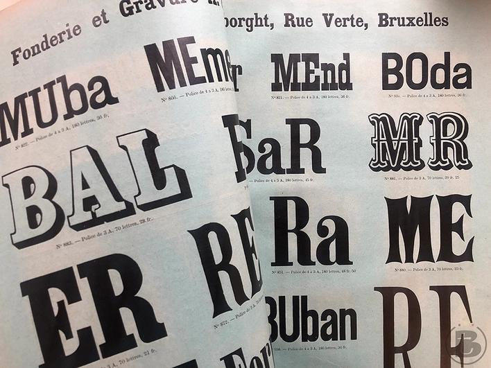
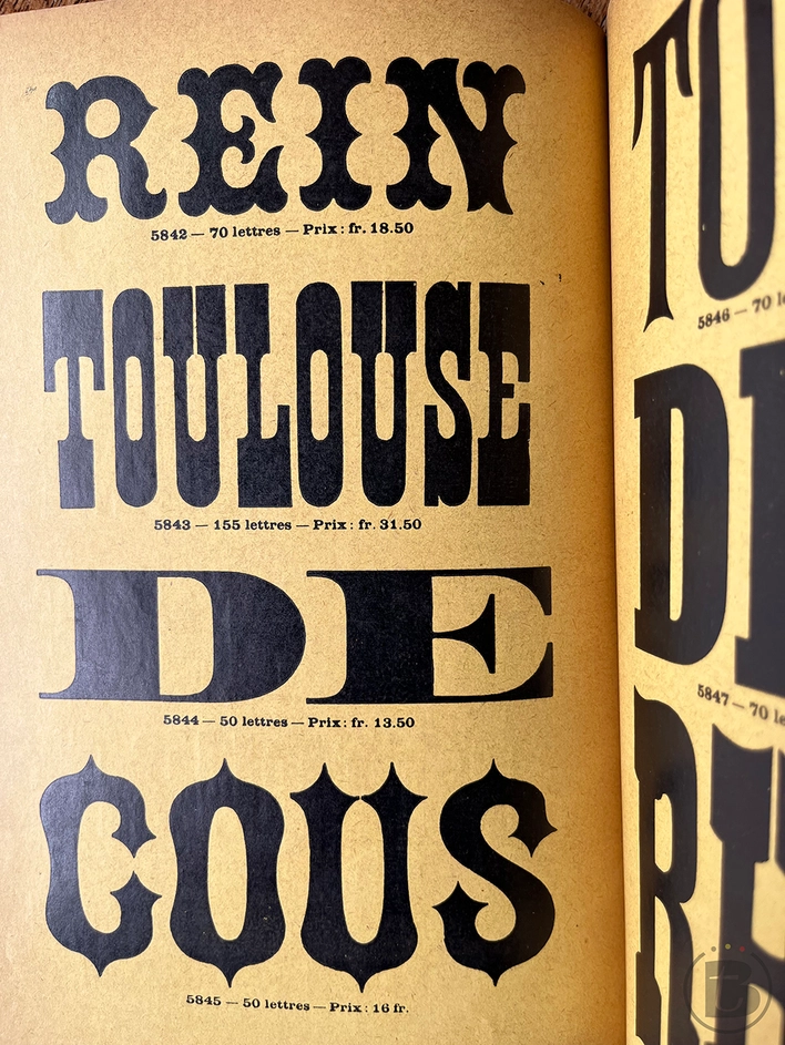
Printing types from the Vanderborght foundry © Jo De Baerdemaeker
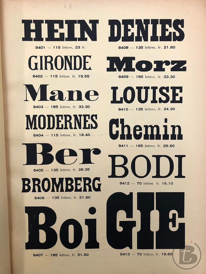
Printing types from the Van Loey-Nouri type foundry © Jo De Baerdemaeker
Which were these three main letter foundries?
These were Vanderborght, Van Loey-Nouri and Carabin-Schildknecht. All three settled near Brussels' North Station, in a neighborhood that was rapidly urbanizing and industrializing at the time. Together, these typefoundries supplied printers all over the country with their own typefaces. Each foundry designed different types of typefaces, responding both to different needs and to certain trends. To market their offerings, they released meticulous, completely hand-composed books and posters with letter specimen. In this way we see extraordinary collections of printing letters inspired by Art Nouveau.
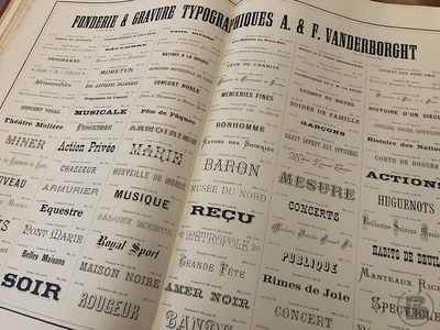
Printing types from the Vanderborght foundry © Jo De Baerdemaeker
What exactly did your research consist of?
As part of a practice-based academic research project at LUCA School of Arts Ghent, I surveyed the historical context of typefoundries and the popularity of typefaces at the time and how they defined visual identity. Thus, across libraries, I recovered about ten different type specimens by Vanderborght, about seven by Carabin-Schildknecht and about four by Van Loey-Nouri. I also examined invoices and advertisements touting their typefaces to gain more insight into their popularity. In addition to that forgotten history, I am researching the possible digitization of the letters so that we can revive them. A newspaper like Le Monde, for example, uses a 'French' font family designed especially for them, whereas our newspapers never did so until now.
A special story that came my way during this project is that the Montagnais (an indigenous Canadian mountain people, ed.), thanks to a cleric from Brussels-based Vanderborght, were given their own typeface with their own custom printing letters so that they could record their language.
Printing types from the Carabin-Schildknecht type foundry © Jo De Baerdemaeker
Printing types from the type foundry Carabin-Schildknecht
How did you select from those hundreds of letters?
For this first phase, I chose six typefaces that differ greatly in style, are both original and unique, do not yet have a digitized variant and were widely used in Belgium.
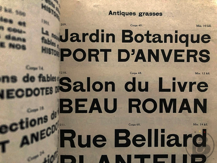
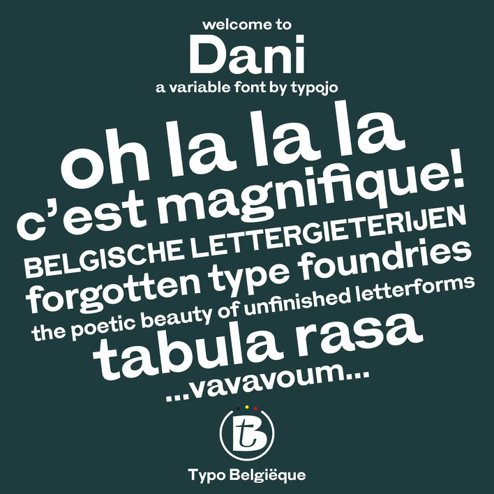
I digitally recreated the sans-serif fonts Antiques Grasses by Van Loey-Nouri and the strongly graphic font Pennequin by Vanderborght. I named a unique fantasy font from the Vanderborght collection 'Brel', and Antiques Grasses 'Dani'.
Although the fonts are displayed in different sizes in the type specimens, contemporary typography demands much more. For each font type, I design variations in italics and bold, develop punctuation, numbers and variable fonts. Without the consumer noticing, these variable fonts adapt to the size and orientation of their screen. This digital environment requires a different way of working: the vertical lines and round curves must fall precisely within the pixels for optimal readability. Each font is not only available for print but also as screen and web fonts. I am not interested in making exact replicas. I want to stimulate the revival of these old typefaces, and therefore they must meet contemporary technical and aesthetic requirements.
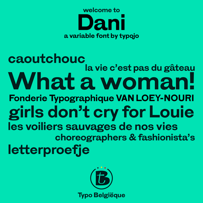
Font Dani, Typo Belgiëque, Studio Type © Jo De Baerdemaeker
Why do we need to pay more attention to our letters?
We underestimate the importance of typography for the visual identity and recognition of a brand. At the same time, there are many more digital applications such as navigation systems or video games that require font designs. Furthermore, a personalized font requires an investment at the start, but in the long term, it avoids specific licenses, making it even cheaper in the end.
Our country lags behind in this field. Many more designers should specialize specifically in typography, and we should be involved from the start of a design process.
Only then can we, as type designers, perfectly respond to the rest of the visual identity. Each of our designs begins with sketches. People must feel the handmade character in a font design, and the proportions – which everyone feels subconsciously – must be just right. In a later stage, we must program each letter to the millimeter, without losing sight of the coherence of the whole. As a result, it can easily take six months to two years for a font family to be completely finalized. However, the client can already work with beta versions in the meantime.
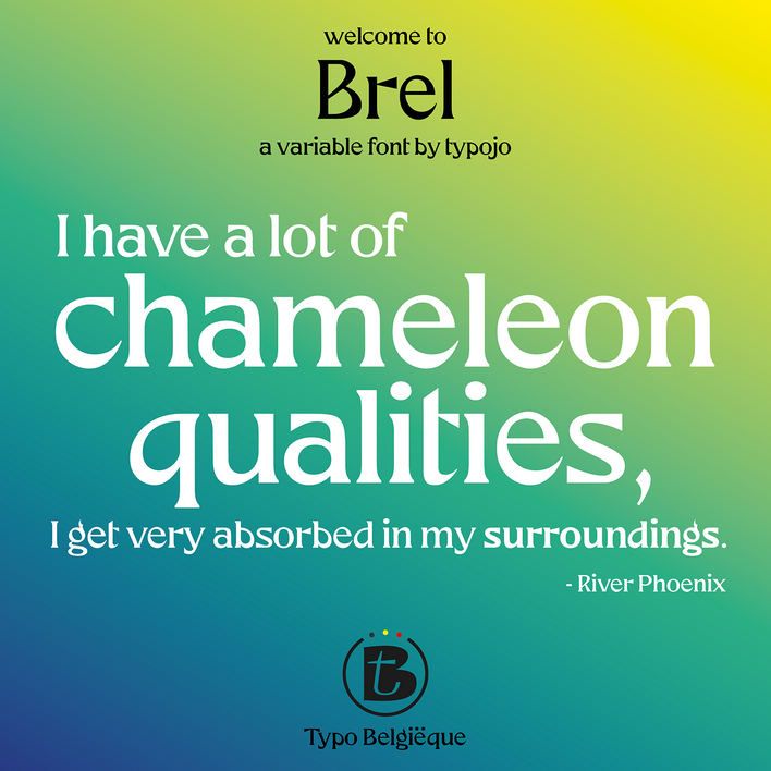
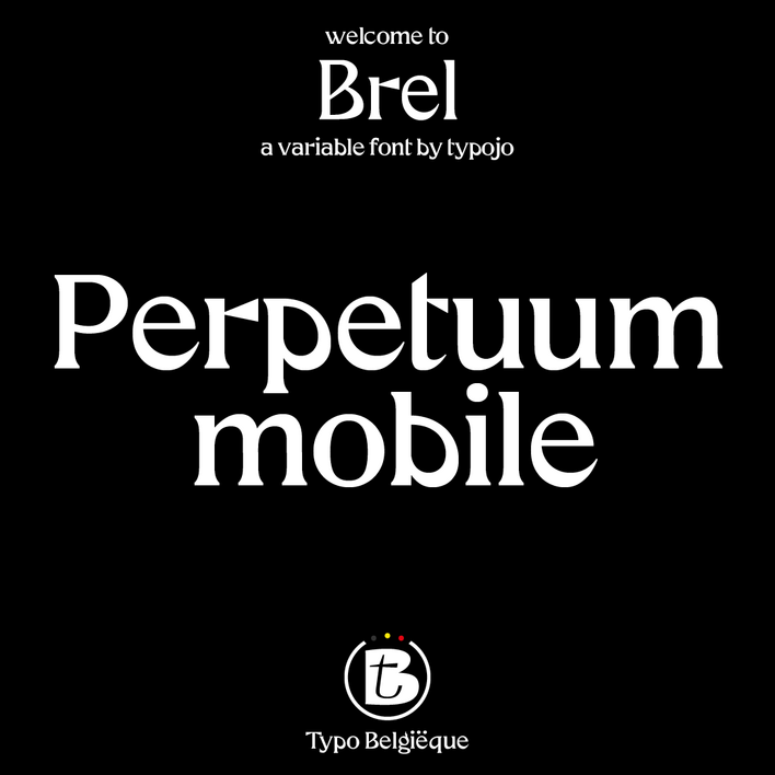
Font Brel, Typo Belgiëque, Studio Type © Jo De Baerdemaeker
The Typo Belgiëque website itself also contains another scoop. Tell.
While websites selling their own fonts have existed in our neighboring countries since the 90s, we did not have a similar site in Belgium. Now that we are reviving our own Belgian fonts, I am launching Typo Belgiëque, a platform where font families such as 'Brel' and 'Dani' are for sale. Similar to the old typographic newspapers, I want to bring that medium back to life.
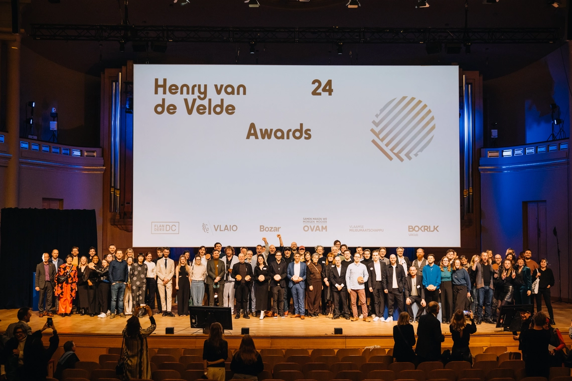
Moreover, fellow designers are welcome to offer their own font designs through the platform. I was pleasantly surprised that Fontrescue (which digitizes letters from the public space and gives them new life, ed.) received the Henry van de Velde Graphics and Public Gold Award, and Jo Klaps and I have already sat down to see how we can collaborate. I am also exploring possibilities with Paul Ibou. If we could design a font for the 200th anniversary of our country with Typo Belgiëque, that would be fantastic.
Jo De Baerdemaeker will present his project Typo Belgiëque at the Internationale Atypl Conference International Atypl Conference in Paris (May 9-14).